# load required packages
library(pacman)
library(tidymodels)
library(caret)
library(rpart)
library(rpart.plot)
library(rattle)
library(randomForest)
library(odbc)
library(DBI)
library(RSQLite)

pacman::p_load(tidyverse,scales,ggthemes, ggplot2, gridExtra, DT, corrplot, broom)

# import the sales dataset
df_sales <- read.csv("sales.csv")Modeling Marketing Campaigns
Data analysis
Machine learning
Tidymodels
Introduction
The deliverable or result of this phase should include:
- Data description
- Early data exploration report
- Data quality report
The Automotive Sales dataset:
The collected data consists of 40,000 distinct customers with 14 variables. The description of each column/variable can be seen below:
| Variable | Description |
|---|---|
| flag | Whether the customer has bought the target product or not |
| gender | Gender of the customer |
| education | Education background of customer |
| house_val | Value of the residence the customer lives in |
| age | Age of the customer by group |
| online | Whether the customer had online shopping experience or not |
| customer_psy | Variable describing consumer psychology based on the area of residence |
| marriage | Marriage status of the customer |
| children | Whether the customer has children or not |
| occupation | Career information of the customer |
| mortgage | Housing Loan Information of customers |
| house_own | Whether the customer owns a house or not |
| region | Information on the area in which the customer are located |
| fam_income | Family income Information of the customer(A means the lowest, and L means the highest) |
Tip
Load packages and import data.
There are 40000 cases in the dataset and 14 covariates.
# look at the data
datatable(df_sales, options = list(pageLength = 5))
initial exploration
We can check the full summary for customer_psy and fam_income column since they contain many categories.
table("Customer Psychology" = df_sales$customer_psy)
#> Customer Psychology
#>    A    B    C    D    E    F    G    H    I    J    U
#> 1427 8197 7830 2353 6650 4058 3951 958 2262 2187 127table("Family Income" = df_sales$fam_income)
#> Family Income
#> A B C D E F G H I J K L U
#> 2274 2169 2687 4582 8432 6641 4224 2498 1622 1614 1487 1617 153There are some interesting finding from the summary. For example, the gender column consists of 3 categories: F (Female), M (Male), and U (Unknown). The child column is similar, with additional value of U (Unknown) and 0 (zero) even though the column should only be Yes or No. The marriage and education column contain empty values. This is not surprising, since the sales team are not instructed to fulfill each column with pre-determined values. However, this means that the incoming data quality is not good and require future standardization in the future. This also show us that we need to cleanse and prepare the data before we do any analysis so that all relevant information can be captured.
On this process, we handle the data based on the problem we find during the data understanding phase. Based on our finding, we will do the following process:
- Change missing/empty value in
education,house_ownerandmarriageinto explicit Unknown - Make all U value in all categorical column into explicit Unknown
- Cleanse the
agecategory by removing the index (1_Unkn into Unknown, 2_<=25 into <=25, etc.) - Cleanse the
mortgagecategory by removing the index
df_clean <- df_sales |>
  mutate(
    flag = ifelse(flag == "Y", "Yes", "No"),
    gender = case_when(gender == "F" ~ "Female",
                       gender == "M" ~ "Male",
                       TRUE ~ "Unknown"),
    child = case_when(child == "Y" ~ "Yes",
                      child == "N" ~ "No",
                      TRUE ~ "Unknown"),
    education = str_remove_all(education, "[0-9.]") |>
      str_trim(),
    education = ifelse(education == "", "Unknown", education),
    age = substr(age, 3, nchar(age)),
    age = ifelse(age == "Unk", "Unknown", age),
    age = case_when(age == "<=35" ~ "26-35",
                    age == "<=45" ~ "36-45",
                    age == "<=55" ~ "46-55",
                    age == "<=65" ~ "56-65",
                    TRUE ~ age
                    ),
    fam_income = ifelse(fam_income == "U", "Unknown", fam_income),
    customer_psy = ifelse(customer_psy == "U", "Unknown", customer_psy),
    online = ifelse(online == "Y", "Yes", "No"),
    marriage = ifelse(marriage == "", "Unknown", marriage),
    mortgage = substr(mortgage, 2, nchar(mortgage)),
    house_owner = ifelse(house_owner == "", "Unknown", house_owner)
  )

df_clean<-df_clean |>
  mutate_all(function(x) ifelse(x == "Unknown", NA, x)) |>
  drop_na() |>
  mutate_if(is.character, as.factor) |>
  mutate(
    flag = factor(flag, levels = c("Yes", "No"))
)SELECT *, CASE WHEN flag='Y' THEN 'Yes'
ELSE 'No'
END AS flag_clean,
CASE WHEN gender = 'F' THEN 'Female'
WHEN gender = 'M' THEN 'Male'
ELSE 'Unknown'
END AS gender_clean,
CASE WHEN child = 'Y' THEN 'Yes'
WHEN child = 'N' THEN 'No'
ELSE 'Unknown'
END AS child_clean,
CASE WHEN LTRIM(RTRIM(SUBSTR(education,3,13)))='' THEN 'Unknown'
ELSE LTRIM(RTRIM(SUBSTR(education,3,13))) END AS education_clean,
CASE WHEN SUBSTR(age,3,6) = '<=35' THEN '26-35'
WHEN SUBSTR(age,3,6) = '<=45' THEN '36-45'
WHEN SUBSTR(age,3,6) = '<=55' THEN '46-55'
WHEN SUBSTR(age,3,6) = '<=65' THEN '56-65'
ELSE SUBSTR(age,3,6) END AS age_clean,
CASE WHEN fam_income = 'U' THEN 'Unknown'
ELSE fam_income
END AS fam_income_clean,
CASE WHEN customer_psy = 'U' THEN 'Unknown'
ELSE customer_psy
END AS customer_psy_clean,
CASE WHEN online = 'Y' THEN 'Yes'
ELSE 'No' END AS online_clean,
CASE WHEN marriage = '' THEN 'Unknown'
ELSE marriage END AS marriage_clean,
SUBSTR(mortgage, 2, 4) AS mortgage_clean,
CASE WHEN house_owner = '' THEN 'Unknown'
ELSE house_owner END AS house_owner_clean
FROM df_sales;Do some final touches on data cleaned with sql
df_clean_sql<-df_clean_sql |>
  select(-flag,-gender,-child,-education,-fam_income,-customer_psy,
         -online,-marriage,-mortgage,-house_owner) |>
  relocate(flag_clean,gender_clean,child_clean,
           education_clean,fam_income_clean,
           customer_psy_clean,online_clean,
           marriage_clean,mortgage_clean,house_owner_clean)|>
  mutate_all(function(x) ifelse(x == "Unknown", NA, x)) |>
  drop_na() |>
  mutate_if(is.character, as.factor) |>
  mutate(
    flag = factor(flag_clean, levels = c("Yes", "No"))
         )

sales_com<-dbConnect(RSQLite::SQLite(), ":memory:")
copy_to(sales_com,df_clean_sql)
House Valuation Distribution
Here we will do visualization to see whether there are any difference between customer who buy our product and who don’t. To visualize a distribution, we can use histogram. The x-axis is the house valuation while the y-axis show the frequency or the number of customer with certain house valuation.
From the histogram, most of our customer has house valuation less than 2,500,000. Some customers are outlier and has house valuation greater than 2,500,000. Their frequency is low and they cannot be seen on the histogram. The distribution for people who buy and not buy are quite similar, therefore we cannot simply decide if a customer will buy our product based on their house valuation.
df_clean_sql |>
  ggplot(aes(x = house_val, fill = flag_clean)) +
  geom_histogram(color = "white", alpha = 0.75) +
  theme(legend.position = "top") +
  ggthemes::scale_fill_stata()+
  scale_x_continuous(labels = number_format(big.mark = ",")) +
  scale_y_continuous(labels = number_format(big.mark = ",")) +
  labs(x = "House Valuation", y = "Frequency",
       fill = "Flag",
       title = "House Valuation Distribution")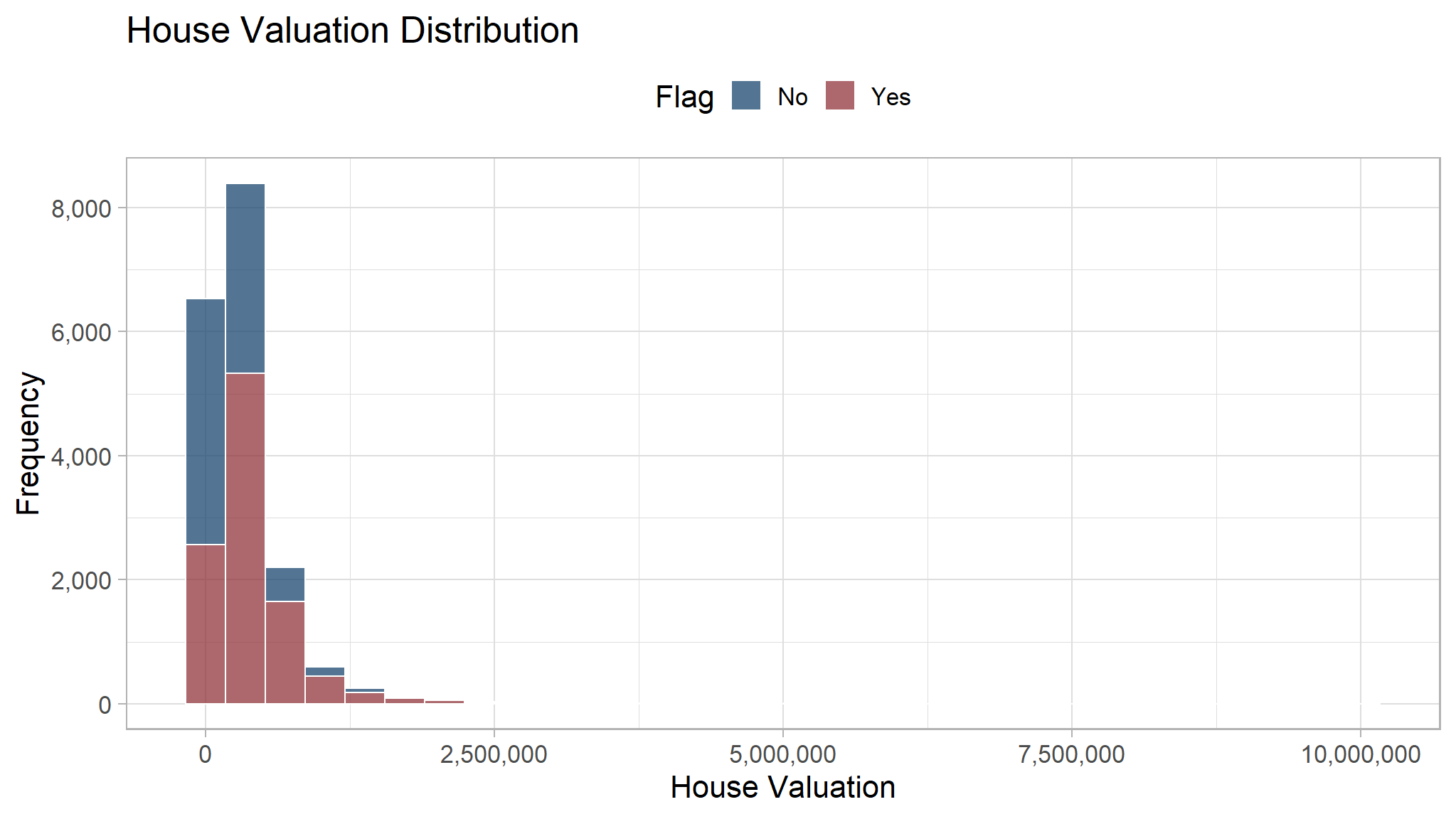
We can cut and remove the outlier to see the distribution better.
df_clean_sql |>
  ggplot(aes(x = house_val, fill = flag_clean)) +
  geom_histogram(color = "white", alpha = 0.75) +
  theme(legend.position = "top") +
   ggthemes::scale_fill_stata()+
  scale_x_continuous(labels = number_format(big.mark = ","), limits = c(0, 2*1e6)) +
  scale_y_continuous(labels = number_format(big.mark = ",")) +
  labs(x = "House Valuation", y = "Frequency",
       fill = "Flag",
       title = "House Valuation Distribution")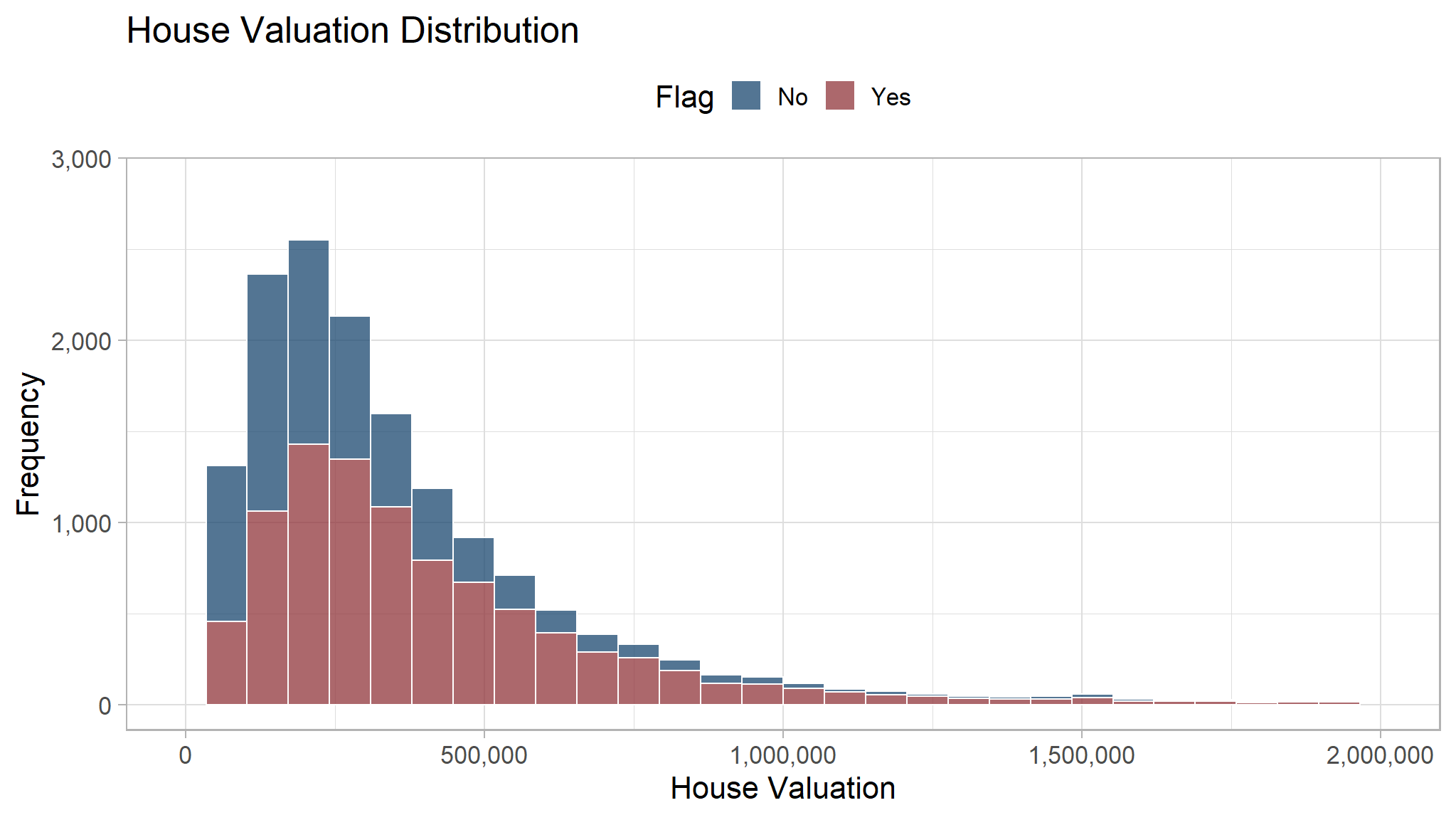
Education Level
We will see if the education level can be a great indicator to decide if a customer has high probability to buy our product. The color of each block represent the frequency of people that fell in that category, with brighter color indicate higher frequency.
Based on the heatmap, people with higher education level (Bach and Grad) are more likely to buy our product. Therefore, education level may be a great indicator to check potential customer.
df_clean_sql |>
  count(flag_clean, education_clean) |>
  ggplot(aes(education_clean, flag_clean, fill = n)) +
  geom_tile(color = "white") +
  geom_text(aes(label = number(n, big.mark = ","))) +
  scale_fill_binned(low = "firebrick", high = "lightyellow",
                    label = number_format(big.mark = ",")) +
  theme(legend.position = "top",
        legend.key.width = unit(15, "mm")) +
  labs(x = "Education",
       y = "Flag",
       fill = "Frequency")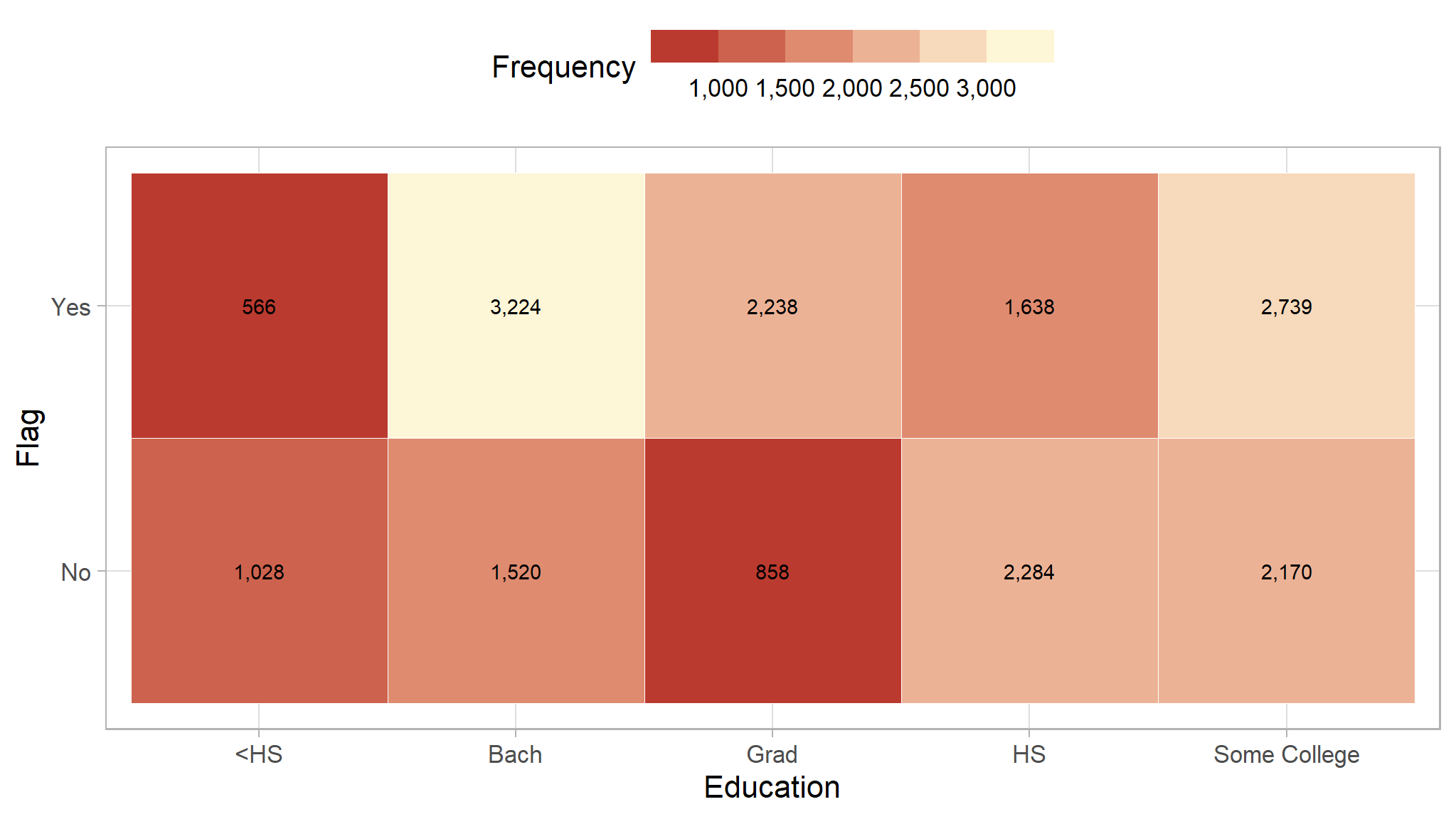
Occupation
We will do the same thing here with the occupation/job. The one that stands out is the professional occupation that has a very high frequency of people who buy our product.
df_clean_sql |>
  count(flag_clean, occupation) |>
  ggplot(aes(occupation, flag_clean, fill = n)) +
  geom_tile(color = "white") +
  geom_text(aes(label = number(n, big.mark = ","))) +
  scale_fill_binned(low = "purple", high = "#07193b",
                    label = number_format(big.mark = ",")) +
  theme(legend.position = "top",
        legend.key.width = unit(15, "mm")) +
  labs(x = "Occupation",
       y = "Flag",
       fill = "Frequency")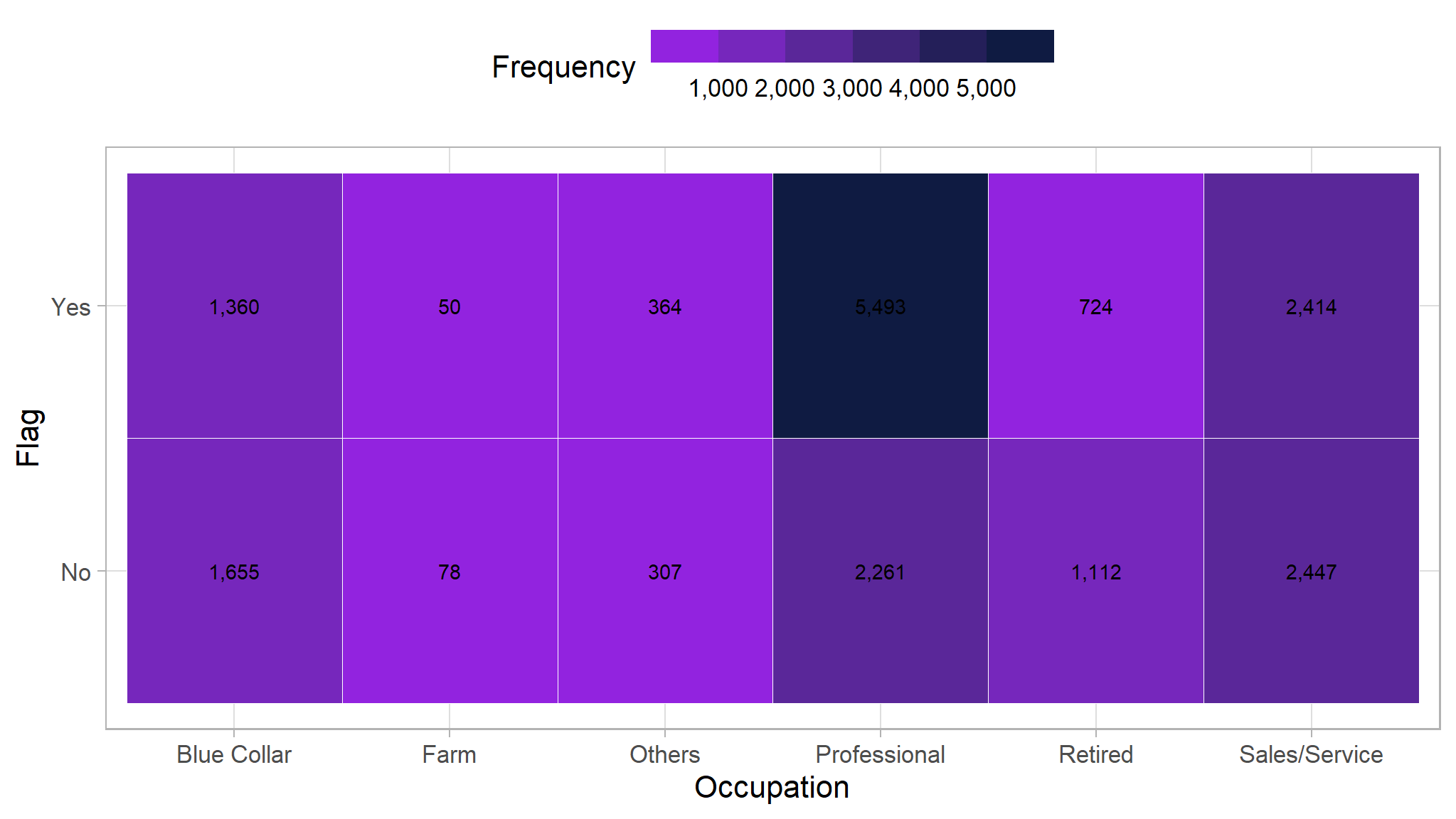
Modeling process
In this section we will use the tidymodels to model our data using random forest, logistic regression and decision tree
model development

Cross-Validation
create train and test data
The cross-validation step is where we will split our data into 2 separate dataset: training dataset and testing dataset.
- Training Dataset: Dataset that will be used to train the machine learning model
- Testing Dataset: Dataset that will be used to evaluate the performance of the model.
set.seed(123)
# Split the dataset
td_split <-initial_split(df_clean,
                                   strata = flag,
                                   prop=0.8)

train <- training(td_split)
test <- testing(td_split)
Model Fitting
model_tree <- rpart(flag~., train)

fancyRpartPlot(model_tree, sub = NULL, main = "Predictive Rule from Decision Tree\n")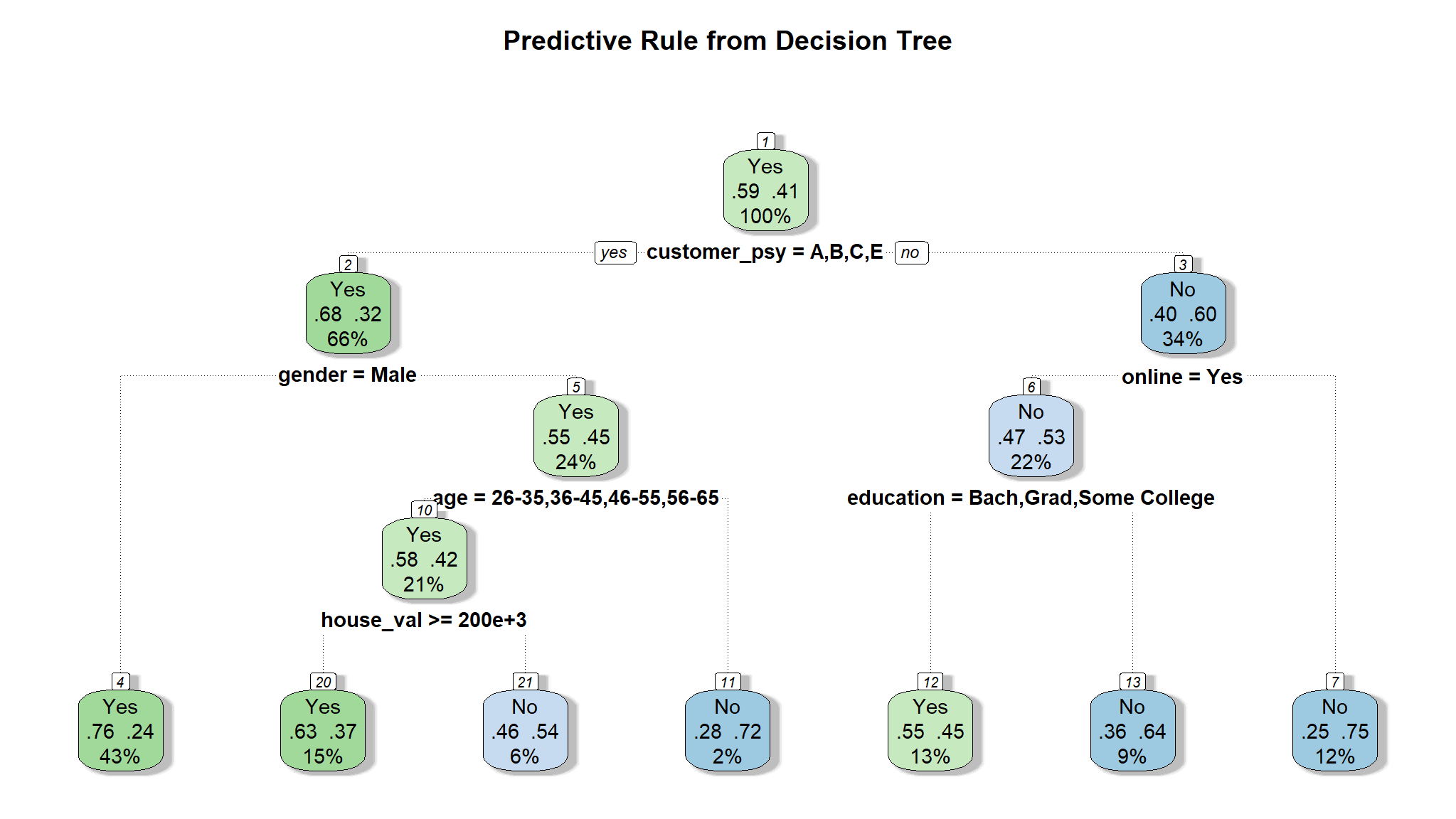
dt_spec<-decision_tree() |>
  set_engine("rpart") |>
  set_mode("classification")

model_fit<-dt_spec |>
  fit(flag~., train)

rpart.plot(model_fit$fit)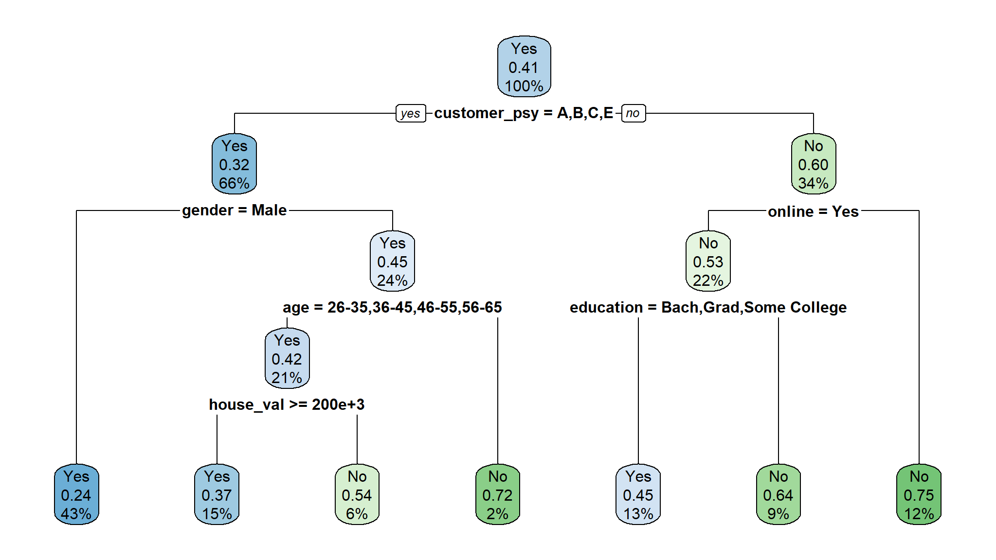
Random Forest
The next model is Random Forest. In short, Random Forest is a collection of decision tree that together make a single decision.
set.seed(1234)
model_rf <- randomForest(flag ~ ., data = train,
                         ntree = 500,
                         nodesize = 1,
                         mtry = 2,
                         importance = T
                         )

model_rf$importance |>
  as.data.frame() |>
  rownames_to_column("var") |>
  ggplot(aes(x = MeanDecreaseGini,
             fill = MeanDecreaseGini,
             y = var |> reorder(MeanDecreaseGini))) +
  geom_col() +
  scale_fill_binned(low = "firebrick", high = "lightyellow")+
  labs(x = "Gini Decrease",
       fill = "Gini Decrease",
       y = "Predictors",
       title = "Variable Importance")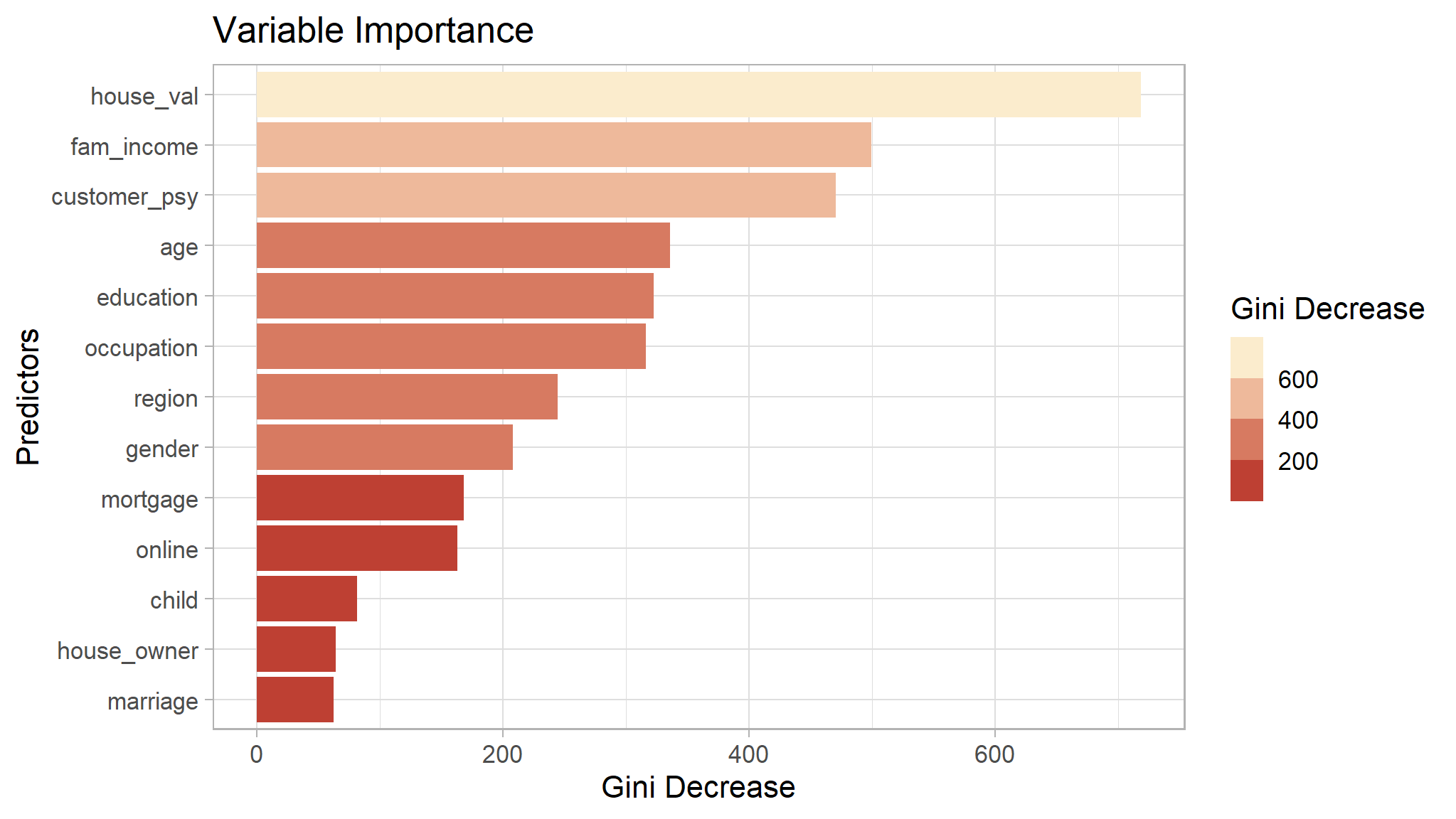
Model Evaluation
In classification problem, we evaluate model by looking at how many of their predictions are correct. This can be plotted into something called Confusion Matrix.
The matrix is divided into four area:
- True Positive (TP): The model predict customer will buy and the prediction is correct (customer buy)
- False Positive (FP): The model predict customer will buy and the prediction is incorrect (customer not buy)
- True Negative (TN): The model predict customer will not buy and the prediction is correct (customer not buy)
- False Negative (FN): The model predict customer will not buy and the prediction is incorrect (customer buy)
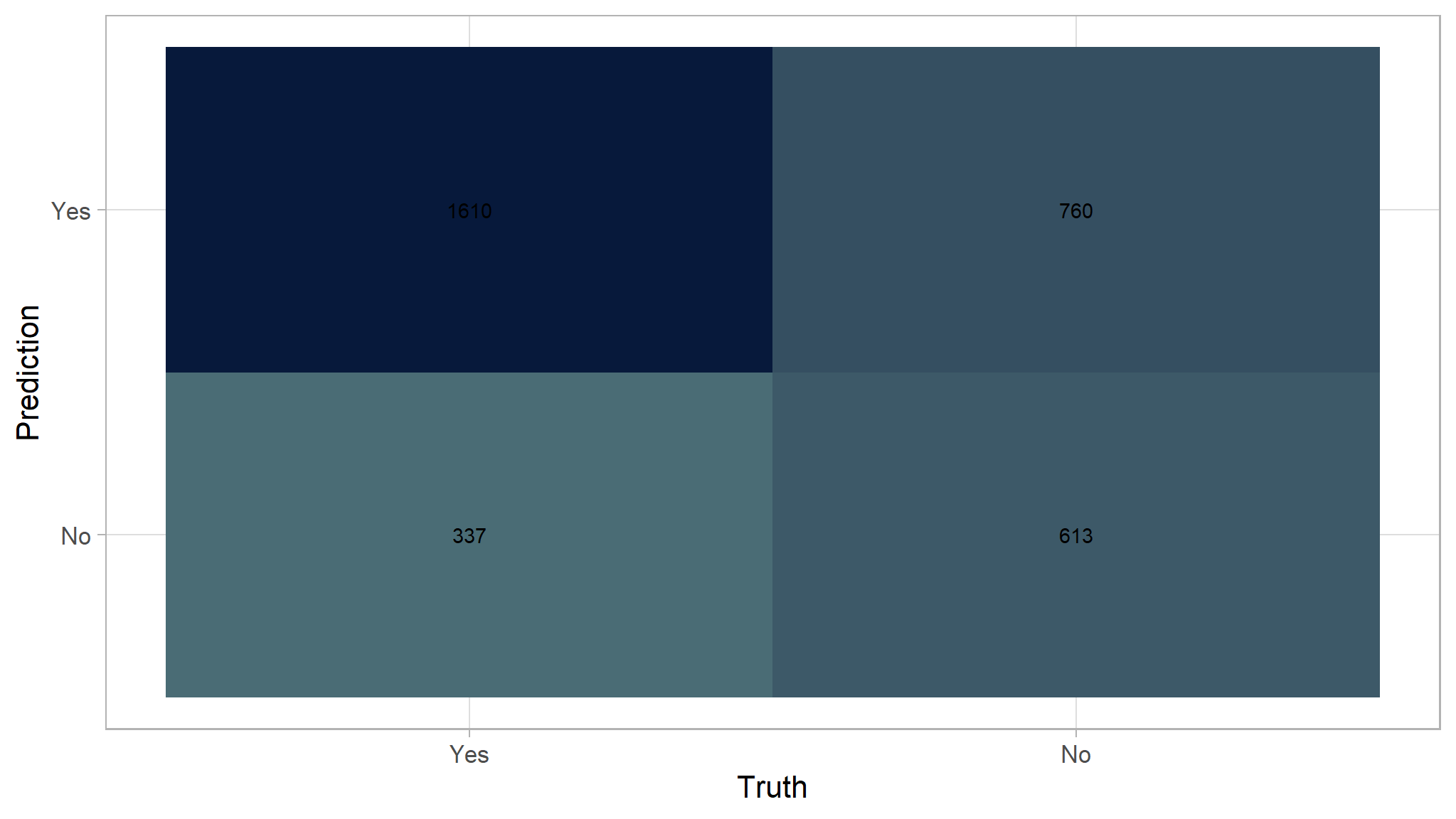
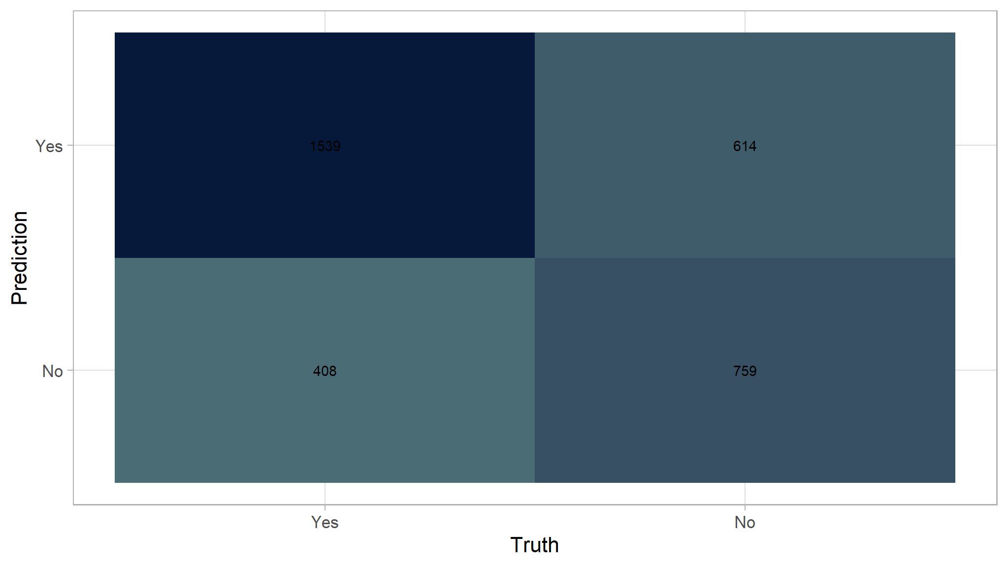
For example, here is the confusion matrix from the decision tree after doing prediction to the testing dataset.
pred_test <- predict(model_tree,test, type = "class")
pred_prob <- predict(model_tree,test, type = "prob")

df_prediction_tree <- as.data.frame(pred_prob) |>
  mutate(prediction = pred_test,
         truth =test$flag)

conf_mat(df_prediction_tree, truth = truth, estimate = prediction) |>
  autoplot(type="heatmap")+
  scale_fill_gradient(
  high = "#07193b",
  low = "#4a6c75"
)
Model results
| .metric | .estimator | .estimate |
|---|---|---|
| accuracy | binary | 0.6695783 |
| kap | binary | 0.2863866 |
| sens | binary | 0.8269132 |
| spec | binary | 0.4464676 |
| ppv | binary | 0.6793249 |
| npv | binary | 0.6452632 |
| mcc | binary | 0.2978861 |
| j_index | binary | 0.2733808 |
| bal_accuracy | binary | 0.6366904 |
| detection_prevalence | binary | 0.7138554 |
| precision | binary | 0.6793249 |
| recall | binary | 0.8269132 |
| f_meas | binary | 0.7458883 |
If we define positive as Yes:
- True Positive (TP): 1610
- False Positive (FP): 760
- True Negative (TN): 613
- False Negative (FN): 337
Next, we can start doing evaluation using 3 different metrics: accuracy, recall, and precision. Those metrics are pretty general and complement each other. There are more evaluation metrics but we will not be discussed it here.
- Accuracy
Accuracy simply tell us how many prediction is true compared to the total dataset.
\[ Accuracy = \frac{TP + TN}{TP + TN + FP + FN} \]
(1610 + 613) / (1610 + 613+ 337 + 760)
#> [1] 0.6695783
From all data in testing dataset, only 67% of them are correctly predicted as buy/not buy.
\[ Accuracy = \frac{1610 + 613}{1610 + 613+ 337 + 760} = 0.673 = 67.0\% \]
- Sensitivity/Recall
Recall/sensitivity only concerns how many customers that actually buy can correctly be predicted. The metric don’t care about the customer that don’t actually buy our product.
\[ Recall = \frac{TP}{TP + FN} \]
1610 / (1610 + 337)
#> [1] 0.8269132
From all customer that actually buy our product, 89% of them are correctly predicted as buy and 16% as not buy.
\[ Recall = \frac{1610}{1610 + 337} = 0.8269 = 82.7\% \]
- Precision
Precision only concern on how many positive prediction that are actually correct. The metric don’t care about customer that is predicted not buy.
\[ Precision = \frac{TP}{TP + FP} \]
1610 / (1610 + 760)
#> [1] 0.6793249
From all customer that is predicted to buy, only 67% of them that are actually buy our product.
\[ Precision = \frac{1610}{1610 + 760} = 0.6793249 = 67.93\% \]
Random Forest
Here is the recap of the evaluation metrics for Random Forest. The model is slightly better than the Decision Tree.
pred_test <- predict(model_rf,test)
pred_prob <- predict(model_rf,test, type = "prob")

df_prediction_rf <- as.data.frame(pred_prob) |>
  mutate(prediction = pred_test,
         truth =test$flag)

conf_mat(df_prediction_rf, truth = truth, estimate = prediction)|>
  autoplot(type="heatmap")+
  scale_fill_gradient(
  high = "#07193b",
  low = "#4a6c75"
)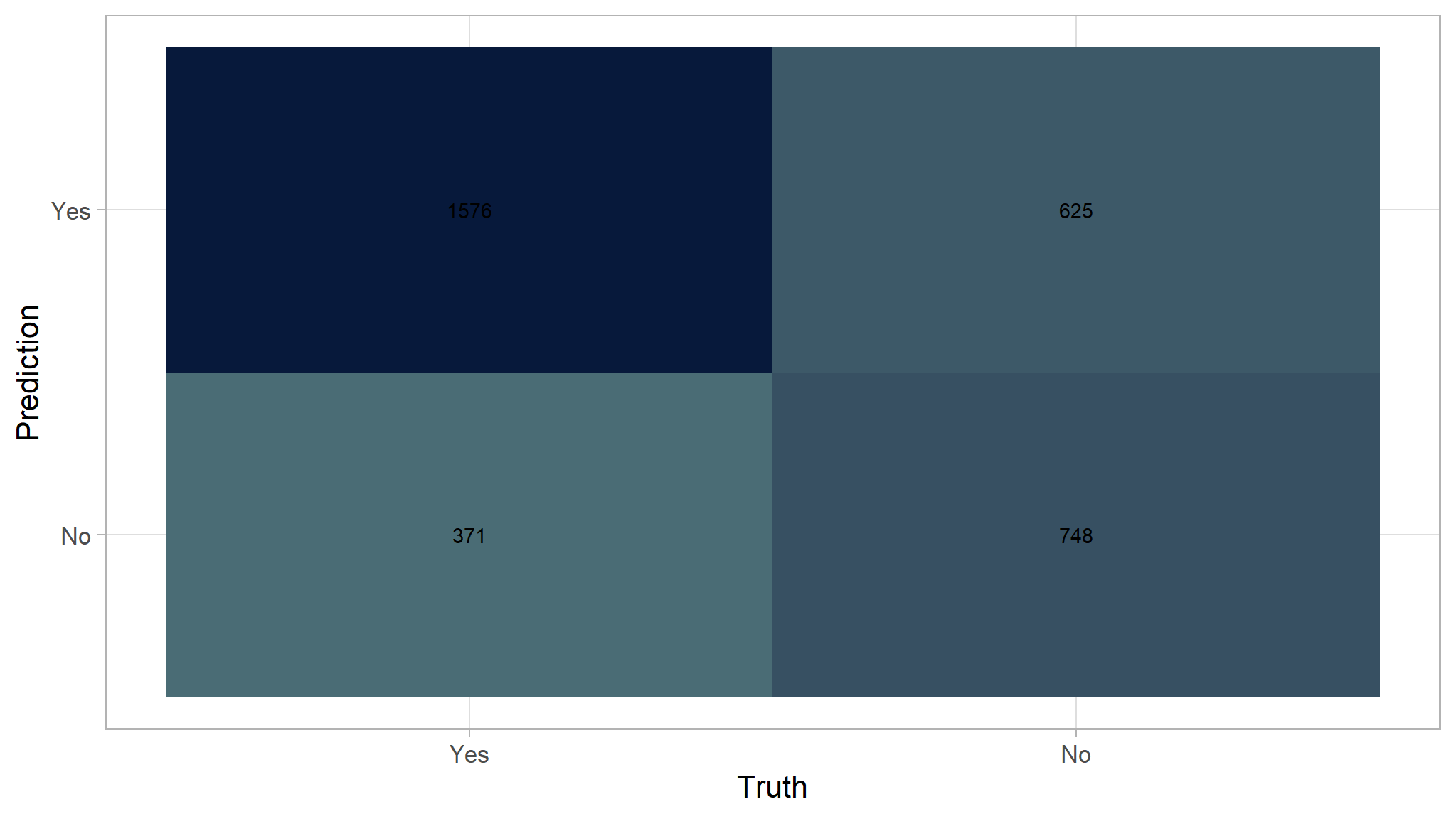
Model Results
| .metric | .estimator | .estimate |
|---|---|---|
| accuracy | binary | 0.7000000 |
| kap | binary | 0.3641737 |
| sens | binary | 0.8094504 |
| spec | binary | 0.5447924 |
| ppv | binary | 0.7160382 |
| npv | binary | 0.6684540 |
| mcc | binary | 0.3690577 |
| j_index | binary | 0.3542429 |
| bal_accuracy | binary | 0.6771214 |
| detection_prevalence | binary | 0.6629518 |
| precision | binary | 0.7160382 |
| recall | binary | 0.8094504 |
| f_meas | binary | 0.7598843 |
\[ Accuracy = \frac{TP + TN}{TP + TN + FP + FN} \]
(1576 + 748) / (1576 + 748 + 625 + 371)
#> [1] 0.7
70% accuracy
logistic regression
train_rcp <- recipes::recipe(flag ~ ., data=train) |>
  step_zv(all_predictors()) |>
  step_dummy(all_nominal_predictors())

# Prep and bake the recipe so we can view this as a seperate data frame
training_df <- train_rcp |>
  prep() |>
  juice()
initialise the model
lr_mod <- parsnip::logistic_reg() |>
  set_engine('glm')
add to workflow
lr_wf <-
  workflow() |>
  add_model(lr_mod) |>
  add_recipe(train_rcp)
lr_fit <-
lr_wf |>
fit(data=train)Extracting the fitted data
I want to pull the data fits into a tibble I can explore. This can be done below:
lr_fitted <- lr_fit |>
  extract_fit_parsnip() |>
  tidy()
I will visualise this via a bar chart to observe my significant features:
lr_fitted_add <- lr_fitted  |>
  mutate(Significance = ifelse(p.value < 0.05,
                               "Significant", "Insignificant")) |>
  arrange(desc(p.value))
#Create a ggplot object to visualise significance
plot <- lr_fitted_add |>
  ggplot(mapping = aes(x=fct_reorder(term,p.value), y=p.value, fill=Significance)) +
  geom_col() +
  scale_fill_calc()+
  theme(axis.text.x = element_text(face="bold",
                                   color="#0070BA",
                                   size=8,
                                   angle=90)) +
  labs(y="P value",
       x="Terms",
       title="P value significance chart",
       subtitle="A chart to represent the significant variables in the model",
       caption="Produced by Bongani")

plotly::ggplotly(plot)
Use fitted logistic regression model to predict on test set
We are going to now append our predictions from our model we created as a baseline to append to the predictions we already have in the predictions data frame:
| .metric | .estimator | .estimate |
|---|---|---|
| accuracy | binary | 0.6921687 |
| kap | binary | 0.3510141 |
| sens | binary | 0.7904468 |
| spec | binary | 0.5528041 |
| ppv | binary | 0.7148165 |
| npv | binary | 0.6503856 |
| mcc | binary | 0.3540565 |
| j_index | binary | 0.3432509 |
| bal_accuracy | binary | 0.6716255 |
| detection_prevalence | binary | 0.6484940 |
| precision | binary | 0.7148165 |
| recall | binary | 0.7904468 |
| f_meas | binary | 0.7507317 |
Note
accuracy is
70