Explainable Machine Learning
DALEX
Visualisations
Machine Learning
Data Disctionery
- Second, we will remove missing cases from the data.
recode the dataset
data_new<- out_new |>
  mutate(Blood_Pressure_Abnormality= ifelse(Blood_Pressure_Abnormality==0,"Normal","Abnormal")) |>
  mutate(Sex = ifelse(Sex==0,"Male","Female")) |>
  mutate(Pregnancy=ifelse(Pregnancy==0,"No","Yes")) |>
  mutate(Smoking=ifelse(Smoking==0,"No","Yes")) |>
  mutate(Chronic_kidney_disease=ifelse(Chronic_kidney_disease==0,"No","Yes")) |>
  mutate(Adrenal_and_thyroid_disorders=ifelse(Adrenal_and_thyroid_disorders==0,"No","Yes")) |>
  mutate(Level_of_Stress=case_when(Level_of_Stress==1~"Less",
                                   Level_of_Stress==2~"Normal",
                                   Level_of_Stress==3~"High"))
Glimpse of the recoded dataset
| First 6 rows of bloodPressure data | ||||||||||||||
|---|---|---|---|---|---|---|---|---|---|---|---|---|---|---|
| Patient_Number | Blood_Pressure_Abnormality | Level_of_Hemoglobin | Genetic_Pedigree_Coefficient | Age | BMI | Sex | Pregnancy | Smoking | Physical_activity | salt_content_in_the_diet | alcohol_consumption_per_day | Level_of_Stress | Chronic_kidney_disease | Adrenal_and_thyroid_disorders |
| 1 | Abnormal | 11.28 | 0.90 | 34 | 23 | Female | Yes | No | 45961 | 48071 | NA | Normal | Yes | Yes |
| 2 | Normal | 9.75 | 0.23 | 54 | 33 | Female | NA | No | 26106 | 25333 | 205 | High | No | No |
| 3 | Abnormal | 10.79 | 0.91 | 70 | 49 | Male | NA | No | 9995 | 29465 | 67 | Normal | Yes | No |
| 4 | Normal | 11.00 | 0.43 | 71 | 50 | Male | NA | No | 10635 | 7439 | 242 | Less | No | No |
| 5 | Abnormal | 14.17 | 0.83 | 52 | 19 | Male | NA | No | 15619 | 49644 | 397 | Normal | No | No |
| 6 | Normal | 11.64 | 0.54 | 23 | 48 | Male | NA | Yes | 27042 | 7513 | NA | High | No | No |
Explanatory data analysis
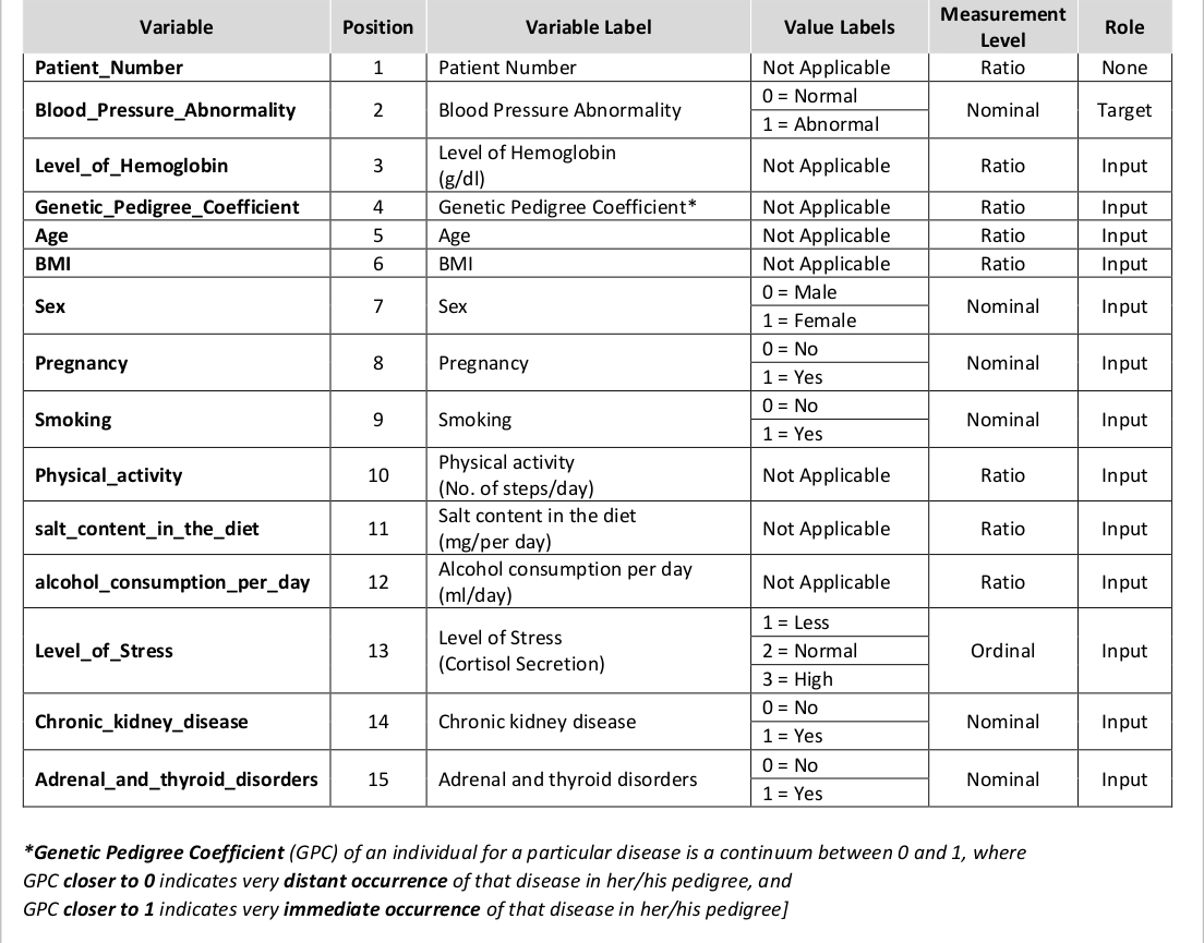
Smoking status by blood pressure Abnormality
- a higher proportion of smokers had abnormal blood pressure
Comments
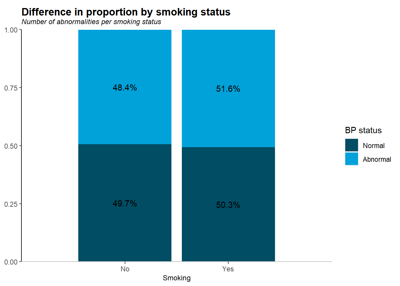
- overally , from the dataset more people had a normal blood pressure as compared to their counterparts
- the dataset looks balanced enough
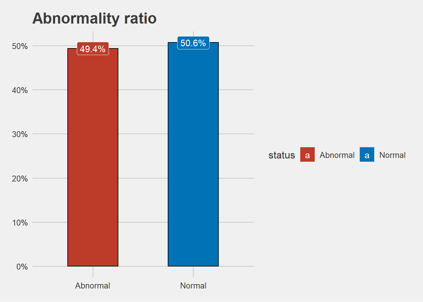
Blood pressure by levels of stress
Note
- majority of those who had high blood pressure also had high stress levels
Explore numeric data
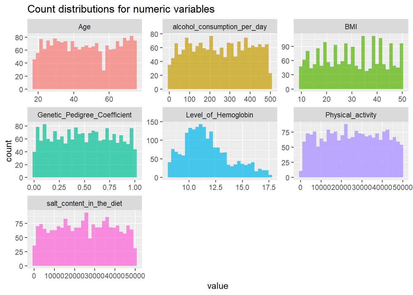
Density plots
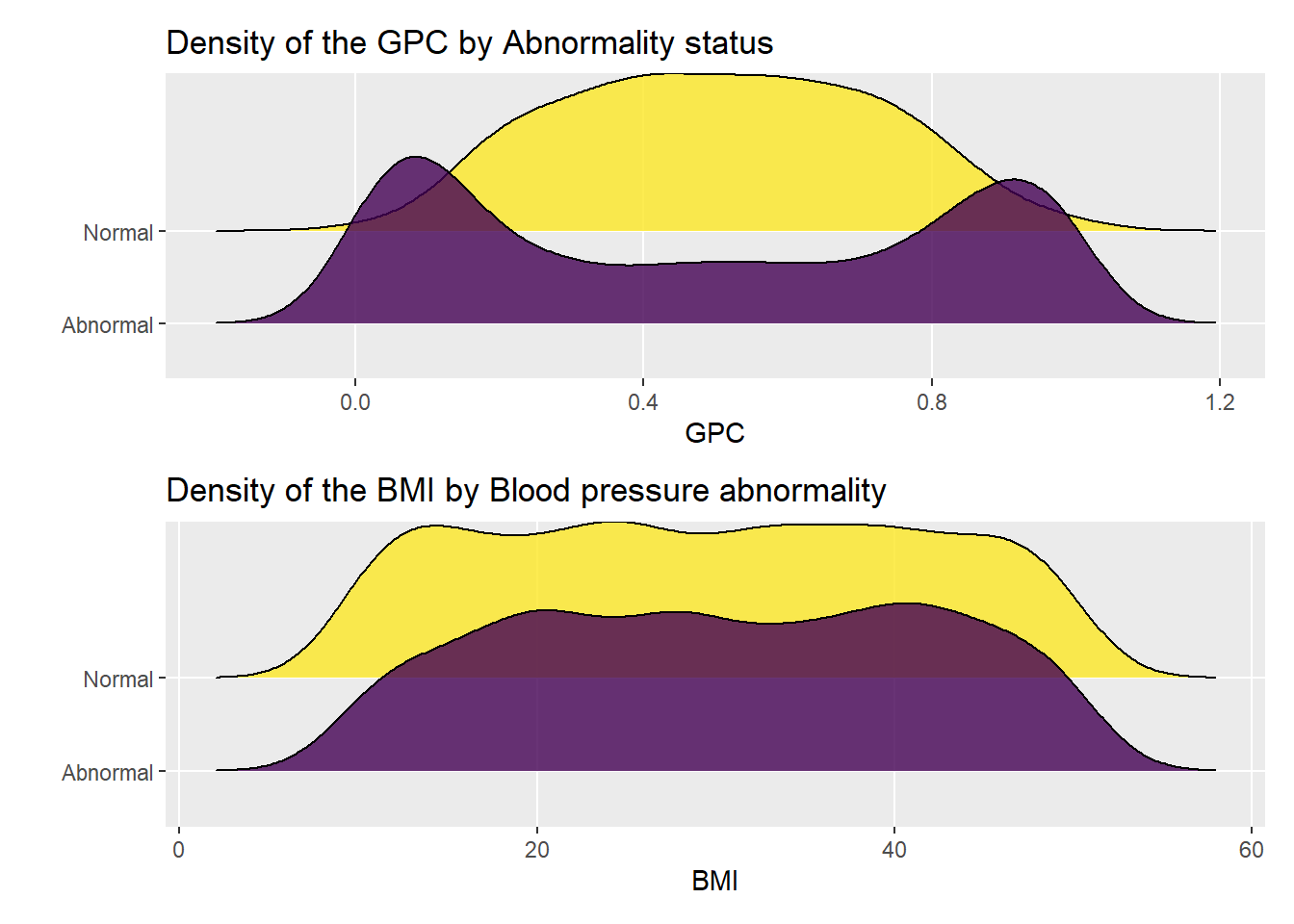
Genetic Pedigree Coefficient
Body Mass Index
Statistical analysis
Chi squared tests
| Characteristic | Abnormal, N = 9871 | Normal, N = 1,0131 | Test Statistic | p-value2 |
|---|---|---|---|---|
| Sex | 6.0 | 0.014 | ||
| Female | 517 / 987 (52%) | 475 / 1,013 (47%) | ||
| Male | 470 / 987 (48%) | 538 / 1,013 (53%) | ||
| Level of Stress | 0.34 | 0.84 | ||
| High | 347 / 987 (35%) | 344 / 1,013 (34%) | ||
| Less | 327 / 987 (33%) | 339 / 1,013 (33%) | ||
| Normal | 313 / 987 (32%) | 330 / 1,013 (33%) | ||
| Chronic_kidney_disease | 1,137 | <0.001 | ||
| No | 274 / 987 (28%) | 1,013 / 1,013 (100%) | ||
| Yes | 713 / 987 (72%) | 0 / 1,013 (0%) | ||
| Adrenal_and_thyroid_disorders | 871 | <0.001 | ||
| No | 391 / 987 (40%) | 1,013 / 1,013 (100%) | ||
| Yes | 596 / 987 (60%) | 0 / 1,013 (0%) | ||
| 1 n / N (%) | ||||
| 2 Pearson’s Chi-squared test | ||||
Note
Comments
- Sex ,Chronic kidney disease and Adrenal and thyroid disorders are all significantly associated with Abnormal blood pressure (p<0.001)
Is blood pressure associated with high blood pressure?
| Blood_Pressure_Abnormality | Smoking | Total | |
| No | Yes | ||
| Abnormal |
478 48.4 % |
509 51.6 % |
987 100 % |
| Normal |
503 49.7 % |
510 50.3 % |
1013 100 % |
| Total |
981 49 % |
1019 51 % |
2000 100 % |
--------Summary descriptives table by 'Blood_Pressure_Abnormality'---------

_________________________________________________________
          Abnormal     Normal           OR        p-value
            N=987      N=1013
¯¯¯¯¯¯¯¯¯¯¯¯¯¯¯¯¯¯¯¯¯¯¯¯¯¯¯¯¯¯¯¯¯¯¯¯¯¯¯¯¯¯¯¯¯¯¯¯¯¯¯¯¯¯¯¯¯
Smoking:
    No   478 (48.4%) 503 (49.7%)       Ref.        Ref.
    Yes  509 (51.6%) 510 (50.3%) 0.95 [0.80;1.13]  0.584
¯¯¯¯¯¯¯¯¯¯¯¯¯¯¯¯¯¯¯¯¯¯¯¯¯¯¯¯¯¯¯¯¯¯¯¯¯¯¯¯¯¯¯¯¯¯¯¯¯¯¯¯¯¯¯¯¯
Note
Comments
- the results suggest that there is no association between blood pressure and smoking at 5% level of significance (more research has to be done)
Boxplots
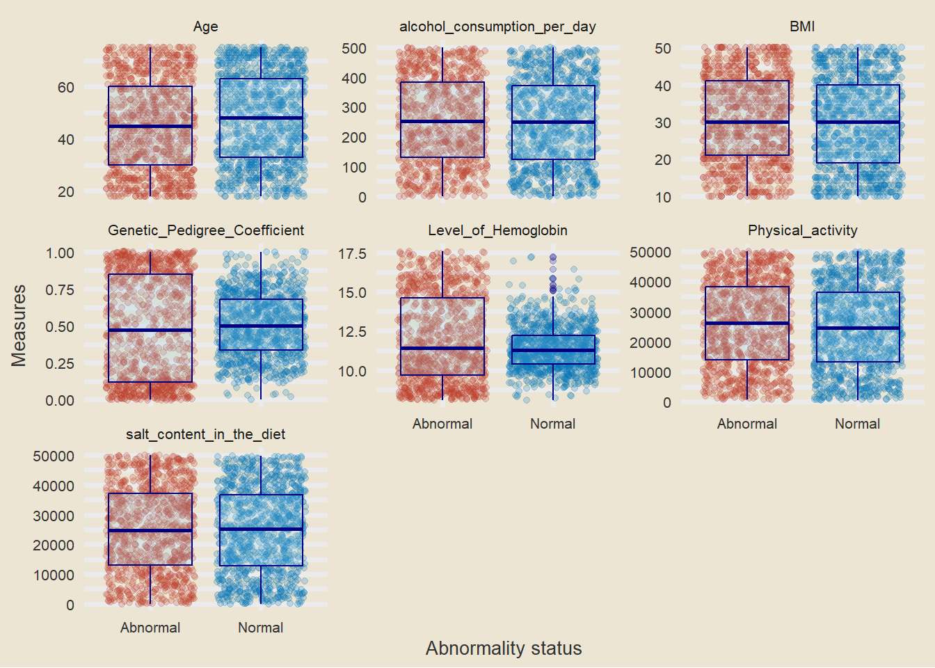
Note
- it should be noted that there is some difference in the level of hemoglobin between people with high blood pressure and those who dont have.
- we will try to answer more using a t.test
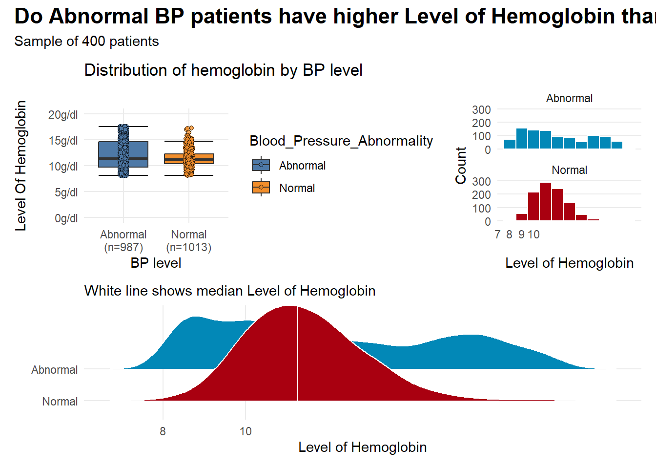
T test
| Characteristic | Abnormal, N = 9871 | Normal, N = 1,0131 | Test Statistic | p-value2 |
|---|---|---|---|---|
| Age | 45 (17) | 48 (17) | -3.0 | 0.003 |
| BMI | 31 (12) | 30 (12) | 1.8 | 0.072 |
| Physical_activity | 25,793 (14,168) | 24,730 (13,852) | 1.7 | 0.090 |
| salt_content_in_the_diet | 25,130 (14,339) | 24,727 (14,091) | 0.63 | 0.53 |
| alcohol_consumption_per_day | 254 (144) | 248 (143) | 0.87 | 0.38 |
| Unknown | 146 | 96 | ||
| Level_of_Hemoglobin | 12.02 (2.75) | 11.41 (1.37) | 6.2 | <0.001 |
| Genetic_Pedigree_Coefficient | 0.49 (0.35) | 0.50 (0.21) | -1.5 | 0.14 |
| Unknown | 30 | 62 | ||
| 1 Mean (SD) | ||||
| 2 Welch Two Sample t-test | ||||
Note
Comments
- there is significant difference in mean BMI and mean haemoglobin level implying that the differences in the averages is not merely an outcome of chance
- lets explore more using simulations and bootstraps
Note
- the plots suggest that there is some observable differences in hemoglogin between the two groups
- but visuals alone are not enough to give a clear picture
Simulation-based tests
We can use the power of bootstrapping, permutation, and simulation to construct a null distribution and calculate confidence intervals.
Response: Level_of_Hemoglobin (numeric)
Explanatory: Blood_Pressure_Abnormality (factor)
# A tibble: 1 × 1
   stat
  <dbl>
1 0.610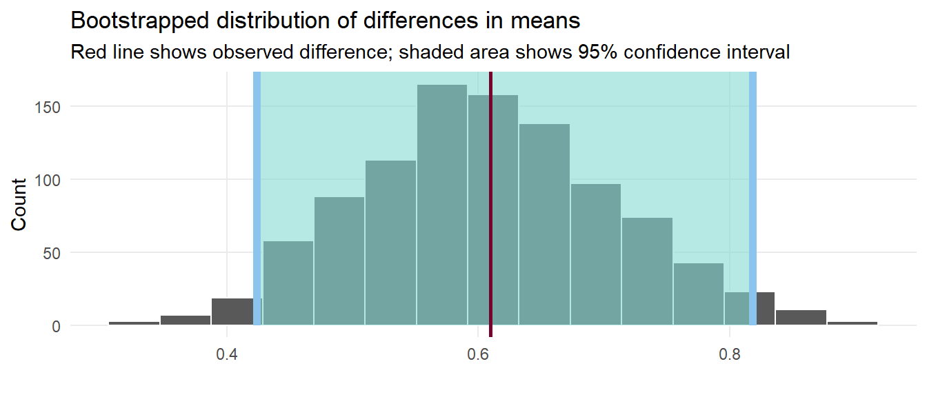
We have a simulation-based confidence interval, and it doesn’t contain zero, so we can have some confidence that there’s a real difference between the two groups.
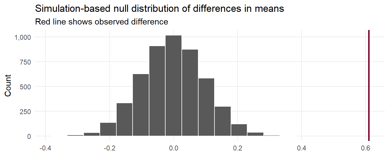
That red line is pretty far to the left and seems like it wouldn’t fit very well in a world where there’s no actual difference between the groups. We can calculate the probability of seeing that red line in a null world (step 4) with get_p_value() (and we can use the cool new pvalue() function in the scales library to format it as < 0.001):
# A tibble: 1 × 2
  p_value p_value_clean
    <dbl> <chr>
1       0 <0.001
Conclusion
We are confident that the difference in mean hemoglobin between the two groups is statistically significant i.e people with more hemoglobin are more likely to develop high blood pressure.
Correlation funnel
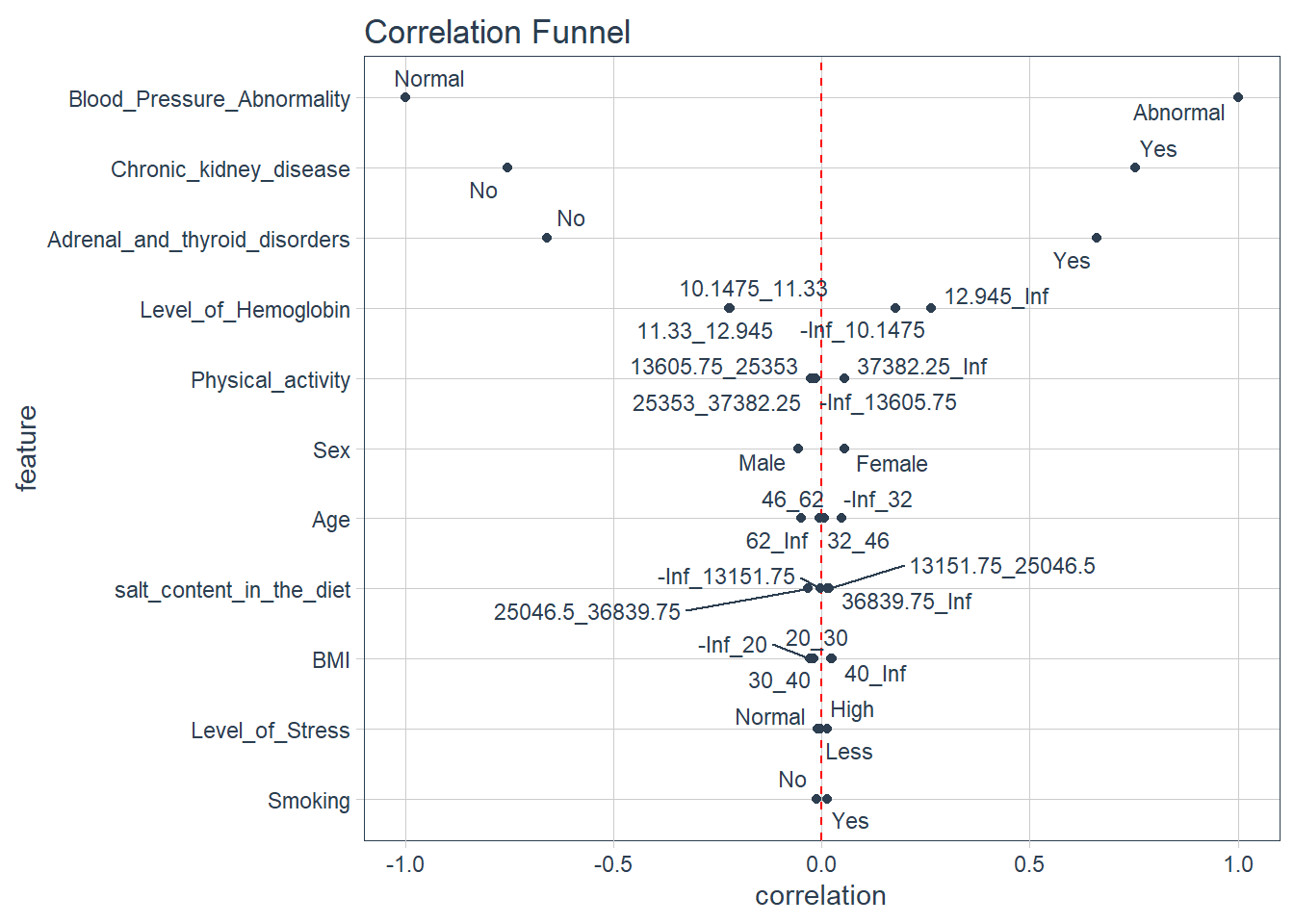
Note
Comments
- the plot above is a correlational funnel and it examines the actual relationship or correlation between the outcome variable and the independent variables
- we note that people with chronic kidney disease are associated with abnormal blood pressure , since the variable is on top ,it makes it the most important variable associated with blood pressure
- people with adrenal and thyroid disorders are also associated with abnomal blood pressure
- whats more interesting is that just like what we saw in the bootstraps and simulations test , higher levels of hemoglobin are associated with Abnormal blood pressure i.e hemoglobin that ranges from (12.985 to infinity).
Preparing data for modeling
pisa <- data_new |>
  dplyr::select(-Patient_Number,-Pregnancy,-Genetic_Pedigree_Coefficient) |>
  mutate(Blood_Pressure_Abnormality=ifelse(Blood_Pressure_Abnormality=="Normal",0,1),
         Blood_Pressure_Abnormality=as.numeric(Blood_Pressure_Abnormality)) |>
  mutate_if(is.character,as.factor) |>
  mutate(Blood_Pressure_Abnormality = as.factor(Blood_Pressure_Abnormality))|>
  select(-alcohol_consumption_per_day )
Data budgetting using
CARET
In this section, the data is split into two distinct sets, the training set and the test set. The training set (typically larger) is used to develop and optimize the model by fitting different models and investigating various feature engineering strategies etc.
The other portion of the data is the test set. This is held in reserve until one or two models are chosen as the methods that are most likely to succeed. The test set is then used as the final arbiter to determine the efficacy of the model.
- Make a 70/30 split specification.
# Activate the caret package
library("caret")

# Set the seed to ensure reproducibility
set.seed(1123)

# Split the data into training and testing sets
index <- createDataPartition(pisa$Blood_Pressure_Abnormality, p = 0.7, list = FALSE)
train <- pisa[index, ]
test  <- pisa[-index, ]
initialise the models
# 5-fold cross-validation
control = trainControl(method="repeatedcv", number = 5, savePredictions=TRUE)

# Random Forest
mod_rf = train(Blood_Pressure_Abnormality ~ .,
               data = train, method='rf', trControl = control)

# Generalized linear model (i.e., Logistic Regression)
mod_glm = train(Blood_Pressure_Abnormality ~ .,
                data = train, method="glm", family = "binomial", trControl = control)

# Support Vector Machines
mod_svm <- train(Blood_Pressure_Abnormality ~.,
                 data = train, method = "svmRadial", prob.model = TRUE, trControl=control)
Exploring DALEX
The first step of using the DALEX package is to define explainers for machine learning models. For this, we write a custom predict function with two arguments: model and newdata. This function returns a vector of predicted probabilities for each class of the binary outcome variable.
In the second step, we create an explainer for each machine learning model using the explainer() function from the DALEX package, the testing data set, and the predict function. When we convert machine learning models to an explainer object, they contain a list of the training and metadata on the machine learning model.
# Activate the DALEX package
library("DALEX")

# Create a custom predict function
p_fun <- function(object, newdata){
  predict(object, newdata=newdata, type="prob")[,2]
  }

# Convert the outcome variable to a numeric binary vector
yTest <- as.numeric(as.character(test$Blood_Pressure_Abnormality))

# Create explainer objects for each machine learning model
explainer_rf  <- explain(mod_rf, label = "RF",
                         data = test, y = yTest,
                         predict_function = p_fun,
                         verbose = FALSE)

explainer_glm <- explain(mod_glm, label = "GLM",
                         data = test, y = yTest,
                         predict_function = p_fun,
                         verbose = FALSE)

explainer_svm <- explain(mod_svm, label = "SVM",
                         data = test, y = yTest,
                         predict_function = p_fun,
                         verbose = FALSE)
Model Performance
The performance metrics considered are:
With the DALEX package, we can analyze model performance based on the distribution of residuals. Here, we consider the differences between observed and predicted probabilities as residuals. The model_performance() function calculates predictions and residuals for the testing data set.
# Calculate model performance and residuals
mp_rf  <- model_performance(explainer_rf)
mp_glm <- model_performance(explainer_glm)
mp_svm <- model_performance(explainer_svm)
Random Forest
Measures for:  classification
recall     : 0.9324324
precision  : 0.975265
f1         : 0.9533679
accuracy   : 0.9549249
auc        : 0.9762956

Residuals:
     0%     10%     20%     30%     40%     50%     60%     70%     80%     90%
-0.8520 -0.1464 -0.0768 -0.0352 -0.0160  0.0000  0.0000  0.0000  0.0000  0.0000
   100%
 0.9880
Accuracy
- Final accuracy of the Random forest model: 96%
Logistic Regression
Measures for:  classification
recall     : 0.9087838
precision  : 1
f1         : 0.9522124
accuracy   : 0.9549249
auc        : 0.9687472

Residuals:
           0%           10%           20%           30%           40%
-3.576319e-01 -1.299010e-01 -9.821237e-02 -7.439163e-02 -5.653513e-02
          50%           60%           70%           80%           90%
-2.779605e-02  2.220446e-16  2.220446e-16  9.329907e-10  2.580774e-09
         100%
 9.663930e-01
Accuracy
- Final accuracy of the logistic regression model: 95%
Support Vector Machines
Measures for:  classification
recall     : 0.9256757
precision  : 0.9963636
f1         : 0.9597198
accuracy   : 0.9616027
auc        : 0.979228

Residuals:
           0%           10%           20%           30%           40%
-7.389004e-01 -1.048530e-01 -8.081160e-02 -6.875113e-02 -5.701340e-02
          50%           60%           70%           80%           90%
-3.764437e-02  1.697916e-05  1.101536e-04  1.381307e-03  2.758670e-03
         100%
 9.407702e-01
Accuracy
- Final accuracy of the support vector machine model: 95%
Based on the performance measures of these three models (i.e., recall, precision, f1, accuracy, and AUC) from the above output, we can say that the models seem to perform very similarly. However, when we check the residual plots, we see how similar or different they are in terms of the residuals. Residual plots show the cumulative distribution function for absolute values from residuals and they can be generated for one or more models. Here, we use the plot() function to generate a single plot that summarizes all three models. This plot allows us to make an easy comparison of absolute residual values across models.
p1 <- plot(mp_rf, mp_glm, mp_svm)
p1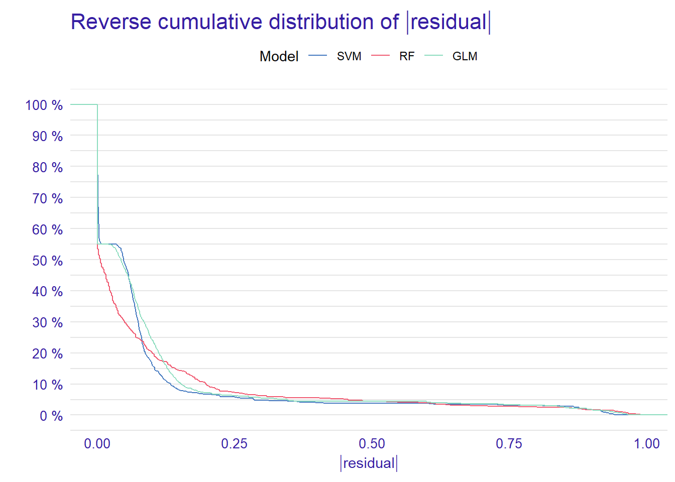
From the reverse cumulative of the absolute residual plot, we can see that there is a higher number of residuals in the left tail of the SVM residual distribution. It shows a higher number of large residuals compared to the other two models. On the right tail all models are almost the same.
In addition to the cumulative distributions of absolute residuals, we can also compare the distribution of residuals with boxplots by using geom = “boxplot” inside the plot function.
p2 <- plot(mp_rf, mp_glm, mp_svm, geom = "boxplot")
p2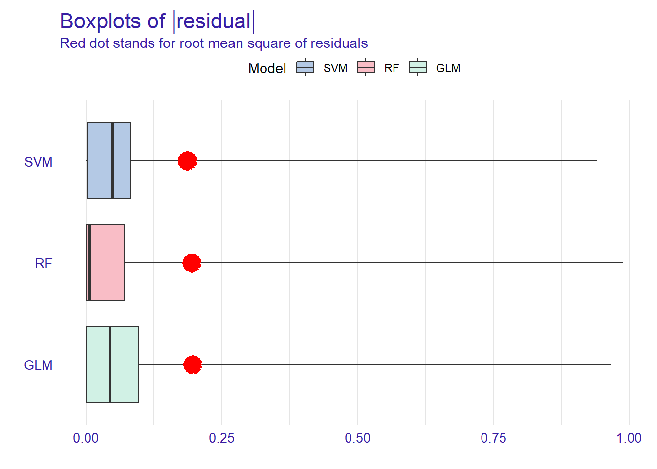
Figure shows that RF has the lowest median absolute residual value. Although the GLM model has the highest AUC score, the RF model performs best when considering the median absolute residuals. We can also plot the distribution of residuals with histograms by using geom=“histogram” and the precision recall curve by using geom=“prc”.
p1 <- plot(mp_rf, mp_glm, mp_svm, geom = "histogram")
p2 <- plot(mp_rf, mp_glm, mp_svm, geom = "prc")
p1 + p2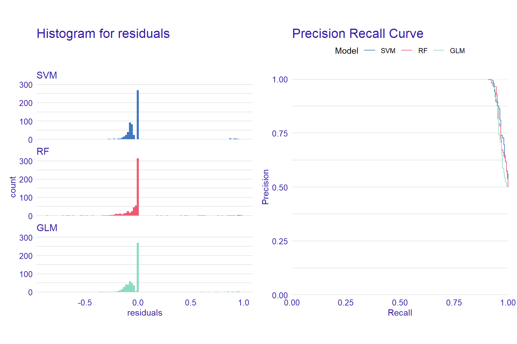
Variable Importance
When using machine learning models, it is important to understand which predictors are more influential on the outcome variable. Using the DALEX package, we can see which variables are more influential on the predicted outcome. The variable_importance() function computes variable importance values through permutation, which then can be visually examined using the plot function.
vi_rf <- variable_importance(explainer_rf, loss_function = loss_root_mean_square)
vi_glm <- variable_importance(explainer_glm, loss_function = loss_root_mean_square)
vi_svm <- variable_importance(explainer_svm, loss_function = loss_root_mean_square)

plot(vi_rf, vi_glm, vi_svm)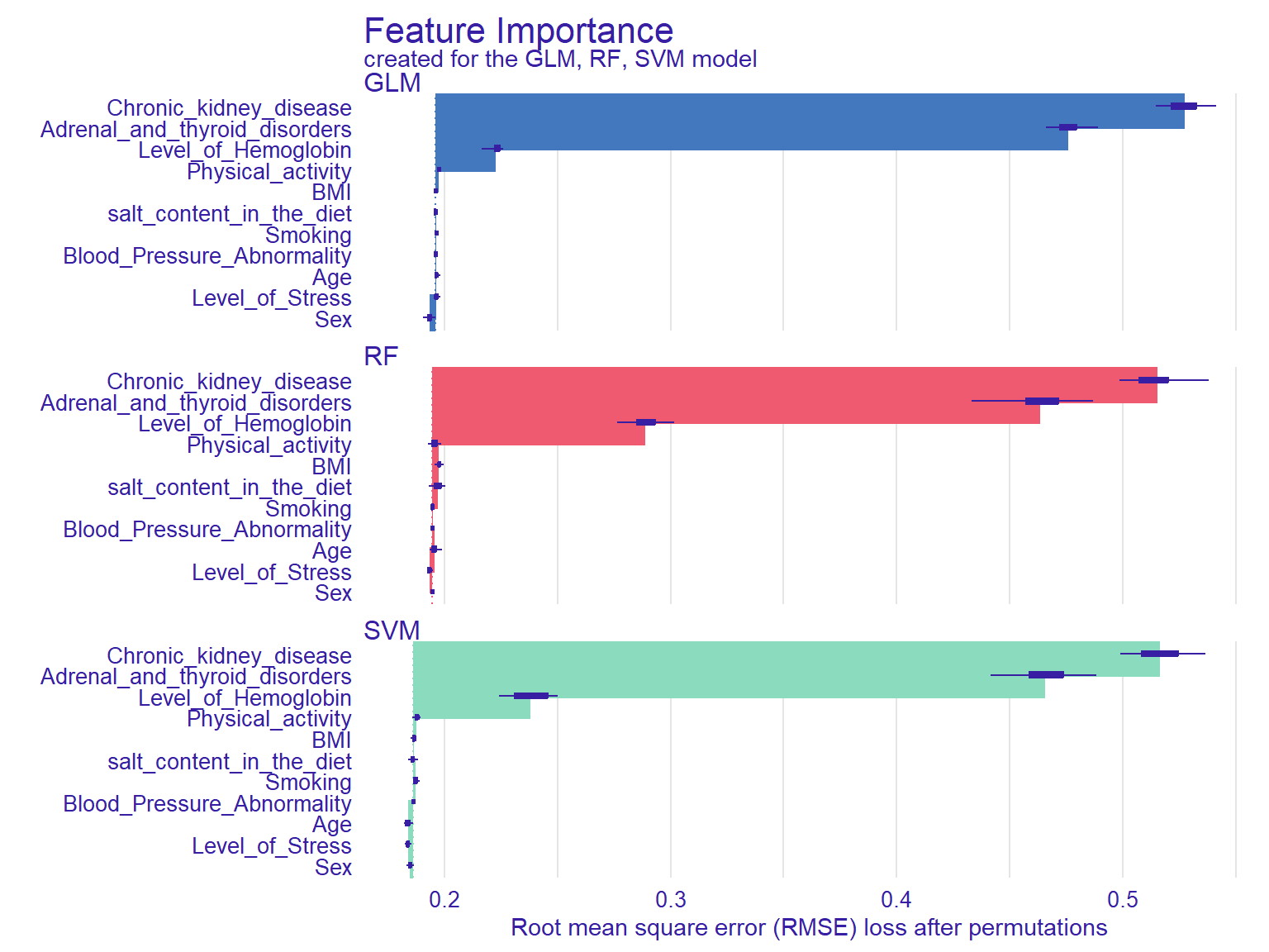
In Figure @ref(fig:ch12), the width of the interval bands (i.e., lines) corresponds to variable importance, while the bars indicate RMSE loss after permutations. Overall, the GLM model seems to have the lowest RMSE, whereas the RF model has the highest RMSE. The results also show that if we list the first three then `chronic kidey disease , Adrenal and thyroid disorders and Level of hemoglobin are the most influential variables on the outcome variable as these seem to influence all three models significantly.
Another function that calculates the importance of variables using permutations is model_parts(). We will use the default loss_fuction - One minus AUC - and set show_boxplots = FALSE this time. Also, we limit the number of variables on the plot with max_vars to show make the plots more readable if there is a large number of predictors in the model.
vip_rf  <- model_parts(explainer = explainer_rf,  B = 50, N = NULL)
vip_glm  <- model_parts(explainer = explainer_glm,  B = 50, N = NULL)
vip_svm <- model_parts(explainer = explainer_svm, B = 50, N = NULL)

plot(vip_rf, vip_glm, vip_svm, max_vars = 4, show_boxplots = FALSE) +
ggtitle("Mean variable-importance over 50 permutations", "") 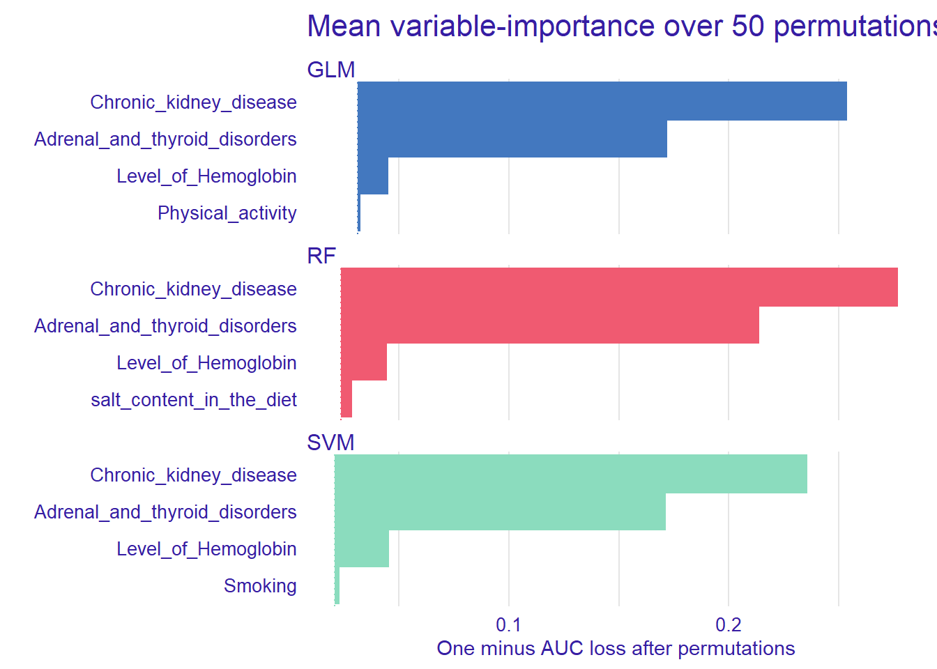
After identifying the influential variables, we can show how the machine learning models perform based on different combinations of the predictors.
Partial Dependence Plot
With the DALEX package, we can also create explainers that show the relationship between a predictor and model output through Partial Dependence Plots (PDP) and Accumulated Local Effects (ALE). These plots show whether or not the relationship between the outcome variable and a predictor is linear and how each predictor affects the prediction process. Therefore, these plots can be created for one predictor at a time. The model_profile() function with the parameter type = “partial” calculates PDP. We will use the hemoglobin variable to create a partial dependence plot.
pdp_rf <- model_profile(explainer_rf, variable = "Level_of_Hemoglobin", type = "partial")
pdp_glm <- model_profile(explainer_glm, variable = "Level_of_Hemoglobin", type = "partial")
pdp_svm <- model_profile(explainer_svm, variable = "Level_of_Hemoglobin", type = "partial")

plot(pdp_rf, pdp_glm, pdp_svm)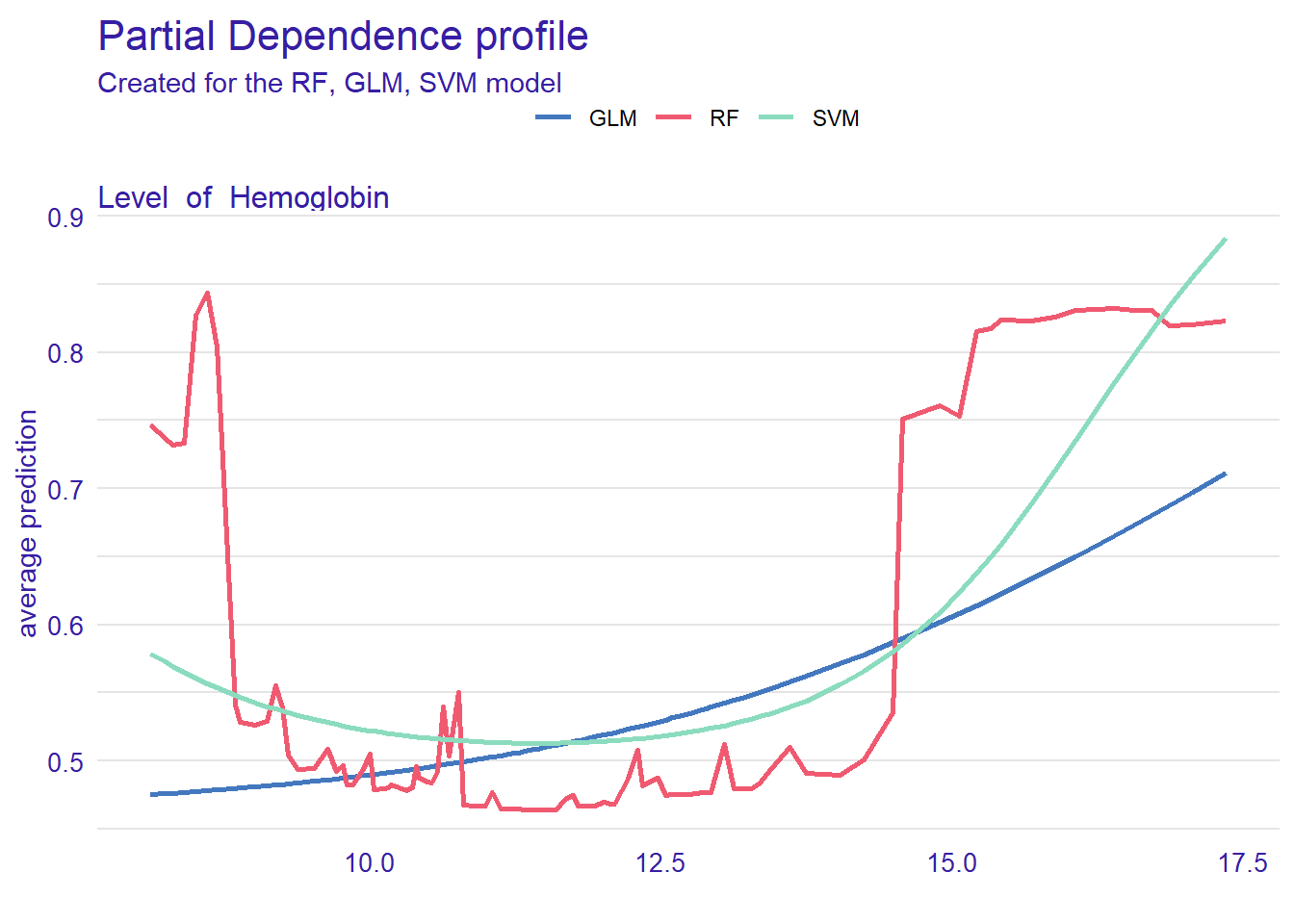
Figure @ref(fig:ch14) can help us understand how level of hemoglobin affects the classification of blood pressure. The plot shows that the probability (see the y-axis) increases from 10 for both both models .
Accumulated Local Effects Plot
ALE plots are the extension of PDP, which is more suited for correlated variables. The model_profile() function with the parameter type = “accumulated” calculates the ALE curve. Compared with PDP plots, ALE plots are more useful because predictors in machine learning models are often correlated to some extent, and ALE plots take the correlations into account.
ale_rf  <- model_profile(explainer_rf, variable = "Level_of_Hemoglobin", type = "accumulated")
ale_glm  <- model_profile(explainer_glm, variable = "Level_of_Hemoglobin", type = "accumulated")
ale_svm  <- model_profile(explainer_svm, variable = "Level_of_Hemoglobin", type = "accumulated")

plot(ale_rf, ale_glm, ale_svm)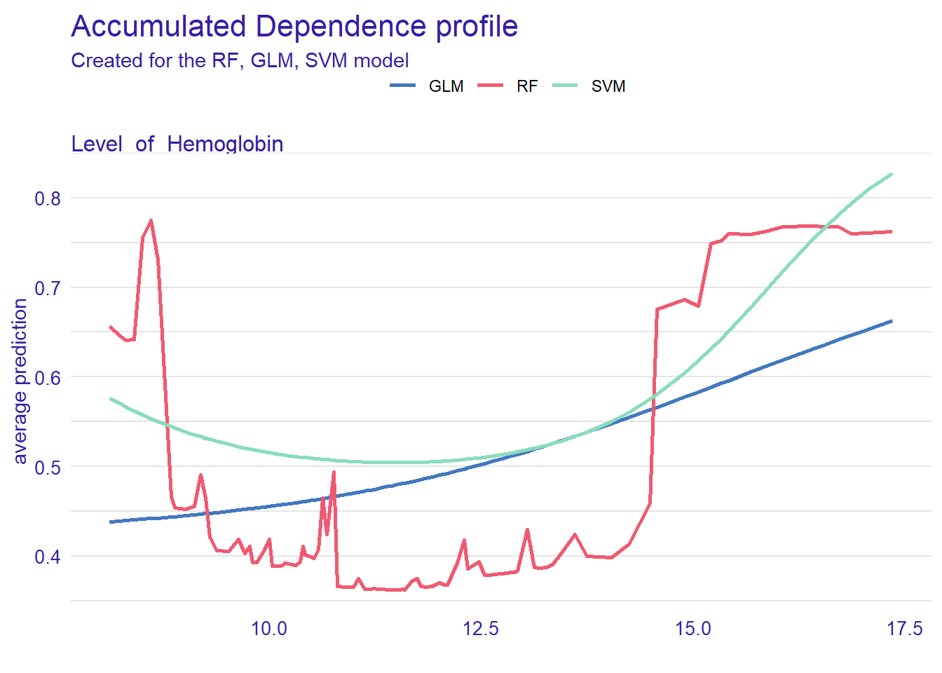
Instance Level Explanation
Using DALEX, we can also see how the models behave for a single observation. We can select a particular observation from the data set or define a new observation. We investigate this using the predict_parts() function. This function is a special case of the model_parts(). It calculates the importance of the variables for a single observation while model_parts() calculates it for all observations in the data set.
We show this single observation level explanation by using the RF model. We could also create the plots for each model and compare the importance of a selected variable across the models. We will use an existing observation (i.e., patient 1) from the testing data set.
patient1 <- test[1, 1:11]
pp_rf <- predict_parts(explainer_rf, new_observation = patient1)

plot(pp_rf)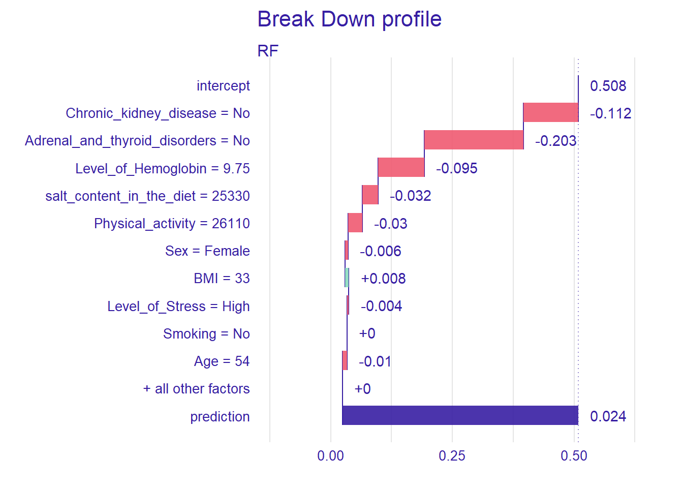
Figure @ref(fig:ch16) shows that the prediction probability for the selected observation is 1. Also, chronic kidney disease seems to be the most important predictor. Next, we will define a hypothetical patient and investigate how the RF model behaves for this patient.
new_patient <- data.frame(Level_of_Hemoglobin=12,
                          Age=19,
                          BMI=35,
                          Sex="Male",
                          Smoking="No",
                          Physical_activity=4854,
                          salt_content_in_the_diet=1583,
                          Level_of_Stress="Normal",
                          Chronic_kidney_disease="Yes",
                          Adrenal_and_thyroid_disorders="No")

pp_rf_new <- predict_parts(explainer_rf, new_observation = new_patient)
plot(pp_rf_new)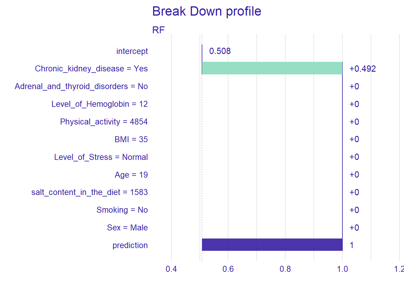
For the new patient we have defined, the most important variable that affects the prediction is Chronic_kidney_disease. Setting type=“shap”, we can inspect the contribution of the predictors for a single observation.
pp_rf_shap <- predict_parts(explainer_rf, new_observation = new_patient, type = "shap")
plot(pp_rf_shap)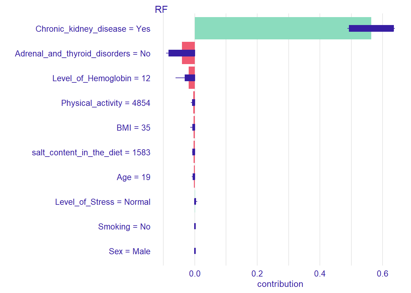
Ceteris Paribus Profiles
In the previous section, we have discussed the PDP plots. Ceteris Paribus Profiles (CPP) is the single observation level version of the PDP plots. To create this plot, we can use predict_profile() function in the DALEX package. In the following example, we select two predictors for the same observation (i.e., patient 1) and create a CPP plot for the RF model. In the plot, blue dots represent the original values for the selected observation.
selected_variables <- c("Level_of_Hemoglobin", "Age")
cpp_rf <- predict_profile(explainer_rf, patient1, variables = selected_variables)

plot(cpp_rf, variables = selected_variables)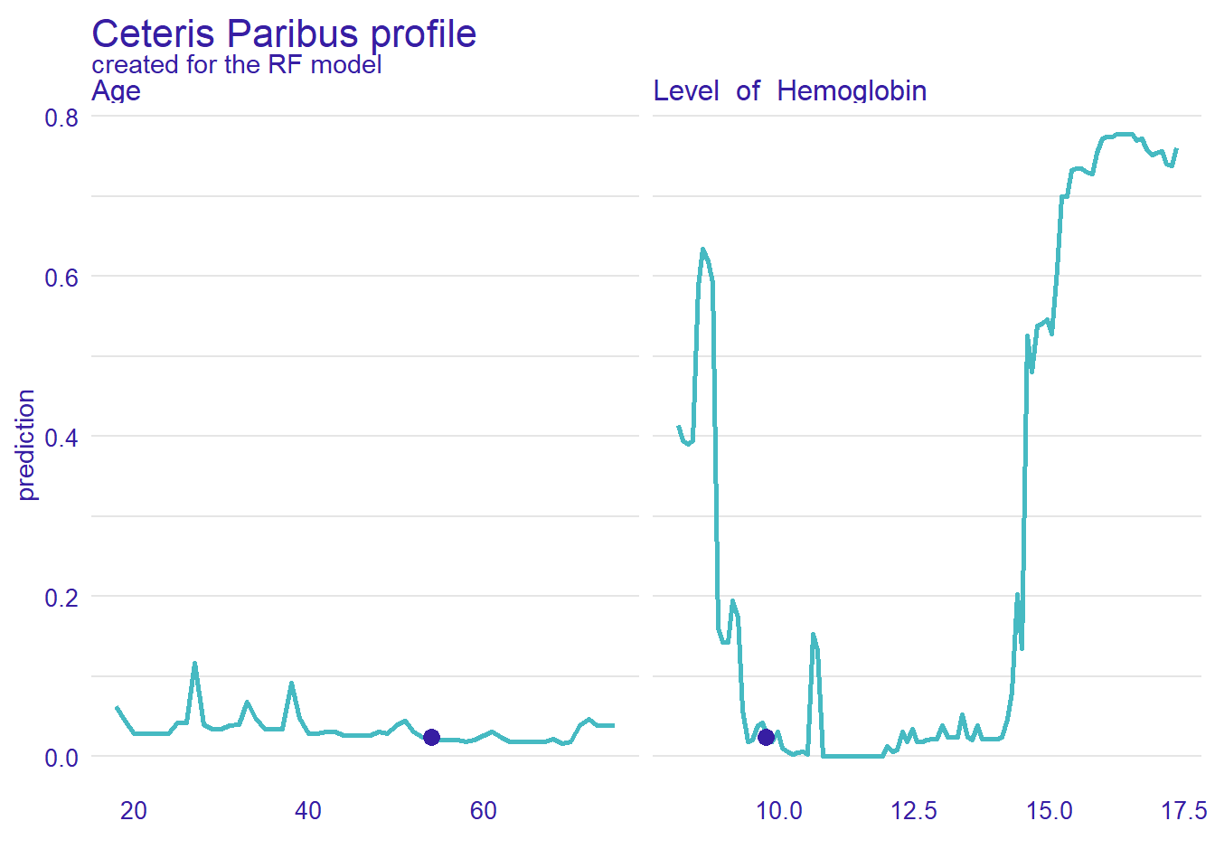
Conclusion
In this post, we wanted to demonstrate how to use data visualizations to evaluate the performance machine learning models beyond the conventional performance measures as well as explore the abnormal blood pressure dataset.